Typography That Sells: Choosing Fonts That Reflect Your Brand Personality
Typography is the silent salesperson on your packaging. While customers may not consciously notice your font choices, these decisions profoundly impact their perception of your brand and influence purchasing behavior. The right typography can convey trust, luxury, playfulness, or reliability before a customer even reads your product description.
Understanding Typography Psychology
Different font categories evoke distinct emotional responses. Serif fonts like Times New Roman communicate tradition, reliability, and sophistication—perfect for luxury goods or established brands. Sans-serif fonts such as Helvetica project modernity, cleanliness, and accessibility, making them ideal for tech products or minimalist brands.
Script fonts add elegance and personality but require careful application. They work beautifully for artisanal products, beauty brands, or anything targeting a feminine demographic. However, avoid script fonts for technical products or children’s items where clarity is paramount.

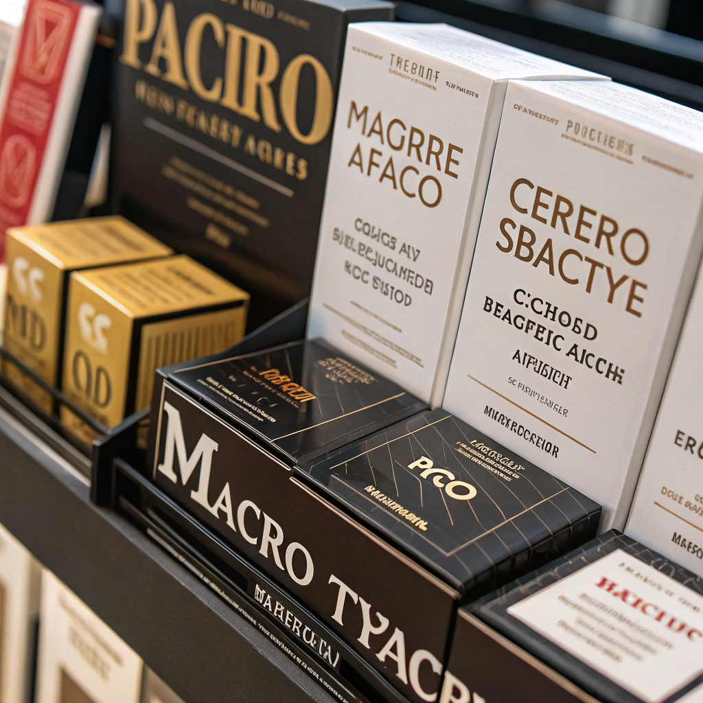
The same product conveys completely different brand personalities through typography choices alone.
Matching Fonts to Brand Archetypes
Your brand archetype should guide font selection. The “Explorer” brand (think outdoor gear) needs rugged, adventurous typography—perhaps a condensed sans-serif with strong character. The “Innocent” brand (baby products, organic foods) benefits from soft, rounded fonts that feel safe and nurturing.
Luxury brands often combine elegant serifs with generous white space, while budget-friendly brands might use bold, straightforward fonts that emphasize value and practicality. Consider how Rolex uses sophisticated serif fonts versus how Walmart employs simple, bold typography.
Readability Rules Everything
Beautiful typography means nothing if customers can’t read it. Ensure sufficient contrast between text and background—black text on white backgrounds remains the gold standard for legibility. Avoid using more than two fonts on a single package to maintain visual hierarchy and prevent confusion.
Test your typography at various sizes. What looks stunning on your computer screen might become illegible when printed on a small package label. Consider the viewing distance too—typography for billboard-sized displays differs dramatically from small product labels viewed up close.
Typography readability can make or break the customer experience at the point of sale.
Cultural Considerations and Global Markets
Typography carries cultural weight. Western audiences often associate script fonts with femininity, while some Asian markets might interpret the same fonts differently. If you’re targeting global markets, research cultural typography preferences and consider how your fonts translate across different languages and character sets.
Some fonts that work beautifully in English become problematic when adapted for languages with different character requirements. Plan for localization from the beginning rather than retrofitting later.
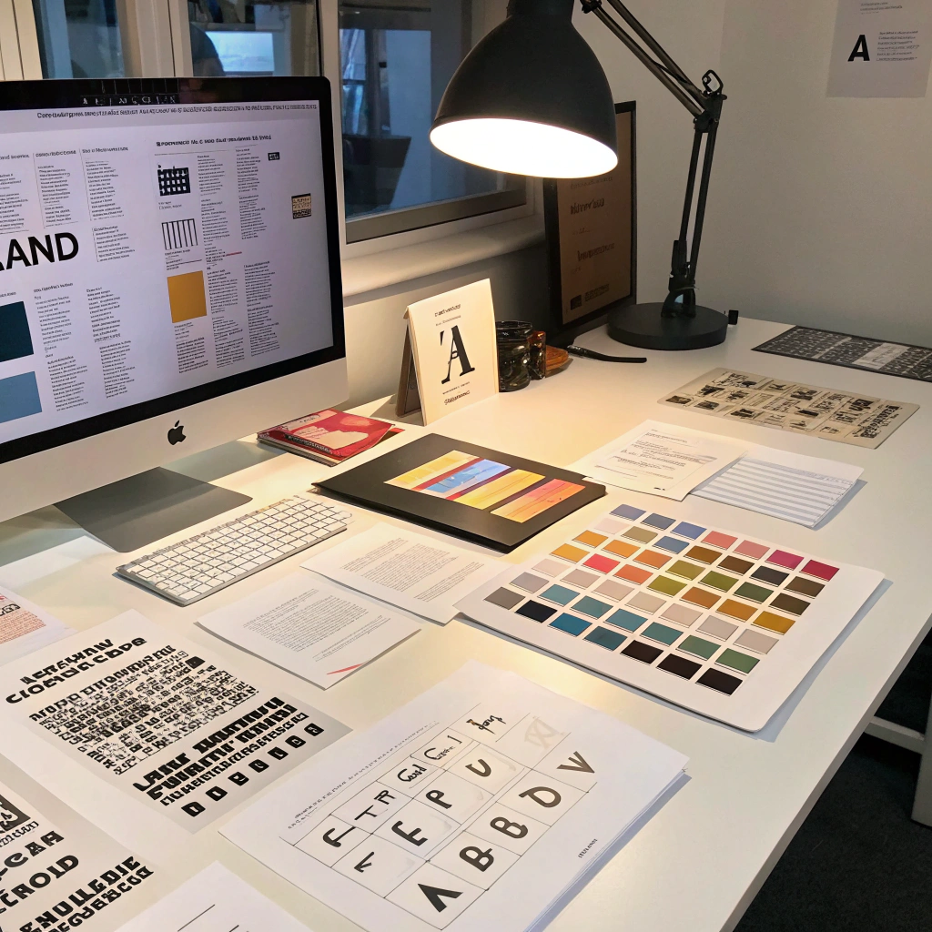
Testing and Refinement
Before finalizing your typography choices, conduct real-world testing. Print samples at actual size and observe them under various lighting conditions. Ask target customers about their impressions—do the fonts align with their expectations of your brand category?
Consider A/B testing different typography approaches if you’re launching online. Small changes in font choice can significantly impact conversion rates and brand perception.
Thorough typography testing ensures your font choices perform effectively in real-world conditions.
The right typography doesn’t just look good—it sells. By aligning your font choices with your brand personality and customer expectations, you create packaging that communicates effectively and drives purchasing decisions.
Remember: great packaging typography feels invisible to customers because it perfectly matches their expectations while subtly reinforcing your brand values. When typography and brand personality align seamlessly, sales naturally follow.